Paola’s love for calligraphy is just one example of how our team of designers have their own particular passions within the world of design – which they can bring into the work they produce for our clients and partners. So many great tips here, but we especially love tip 5 around having fun!
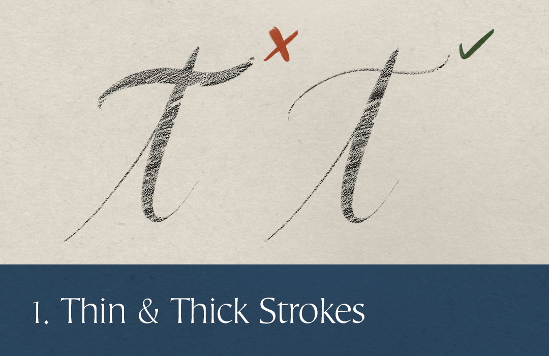
Tip 1: Thin & Thick Strokes
When working with calligraphy or lettering, avoid having two thick strokes overlapping. It creates undesired heavy focus points, and makes the design look sloppy.
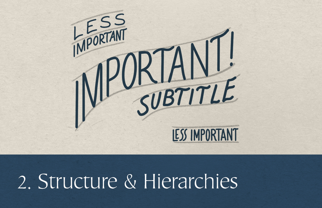
Tip 2: Structure & Hierarchies
Start your design with a defined structure with clear hierarchies. Define early on which parts of a quote or text can be considered the most and the least important, and draw a structure according to that, giving more space or the most focal points of the composition to whatever needs to be read better.
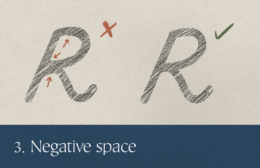
Tip 3: Negative space
Be mindful of negative space, either when drawing a character, adjusting kerning or when creating a text composition – it really is as important as positive space. Even if you’re a beginner, a careful consideration of white space inside a character, for example, can go some way to marking you out as a pro.
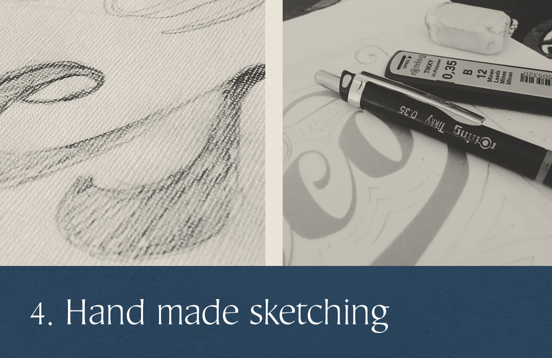
Tip 4: Hand made sketching
In the everyday rush of things, it’s easy to jump straight to designing on the computer, but in doing so we could fall into uncreative territory, repeating the same solutions again and again. Having a little sketchbook handy for quick drafts can help us try new ways of using the space, of structuring content, of doing a letter shape; it gives us a flexibility and freedom that the computer just lacks.
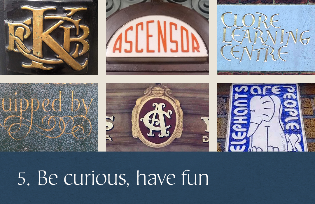
Tip 5: Be curious, have fun and be playful
Follow your favourite type, lettering and calligraphy artists – and specialised curated feeds of typography. Create Pinterest boards, take pictures of signs on the street (honestly, a marvellous hobby!), buy books – especially old ones – get inspiration from everywhere you can and try new things. Fall in love with a style and do it until you’re bored with it, then try something new. The possibilities are infinite, typography is such a vast creative and communicational tool, there are always new ways of using it in your designs.